What is a bar chart?
A bar chart is a diagram that uses rows of horizontal or vertical bars to show information.
The title tells you what the bar chart is about.
The vertical and horizontal lines are called axes.
The horizontal line is called the 𝒙-axis. The vertical line is the 𝑦-axis.
Both axes are always labelled, so you know what is being shown.
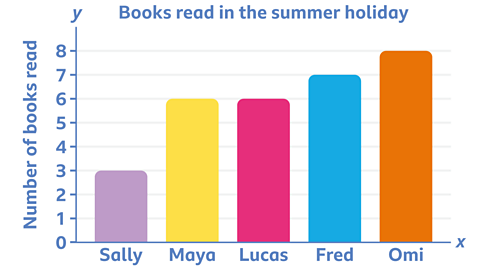
Look at this bar chart. Can you see that Omi read 5 more books than Sally during the summer holiday?
Quiz: Bar charts
Why not see how much you know about this topic already? Then work through the page and see if you can beat your score.
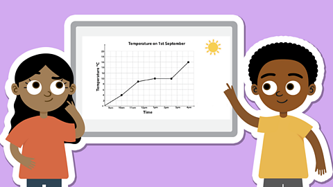
Understanding bar charts
When you read a bar chart, remember the bars should all have an equal width. The length of each bar shows a certain amount.
Look at the title first.
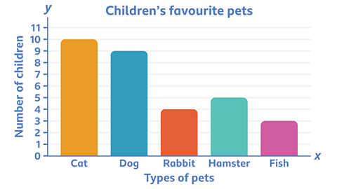
This bar chart is all about children’s favourite pets.
Look at the values and labels for each axis. The 𝒙-axis shows the types of pet and the 𝑦-axis shows how many children chose each pet.
Look at the height of the bars. These show the number of children that chose each pet.
Can you see how many children chose a cat as their favourite pet?
The height of each bar lets you see which pet was the most and least popular.
Read the top of the bar for cats and see which number it reaches on the 𝑦-axis.
10 children chose cats.
How many more children chose a dog than a fish?
A dog was chosen by 9 children, while a fish was chosen by 3.
9 - 3 = 6
6 more children chose a dog than a fish.
Changing scales
The scale on the 𝒙-axis or 𝑦-axis sometimes goes up in steps of 2, 10 or other amounts.
You need to look at the scale to make sure you read the numbers correctly.
Look at the scale on the 𝒙-axis on this bar chart.
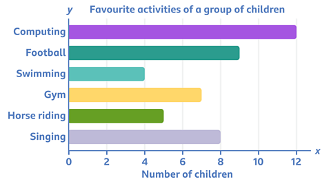
It goes up in 2s. Look at the numbers reached by each bar.
Computer activities are the most popular, enjoyed by 12 children.
Football is played by 9 children. You can work this out because the bar is halfway between 8 and 10.
Example
Look at this bar chart.
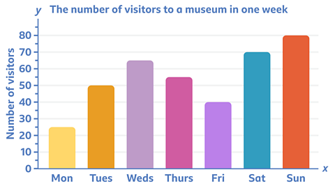
Can you work out how many more people visited the museum on Sunday than on Monday?
Check the number scale on the 𝑦-axis carefully to work out the answer.
✓ 55 more people visited the museum on Sunday than on Monday.
80 people visited on Sunday and 25 people visited on Monday.
80 – 25 = 55
Play Guardians: Defenders of Mathematica to get ready for SATs. game
In this game, use the times tables and more maths skills to defeat monsters and reclaim the Kingdom.

More on Tables, graphs and charts
Find out more by working through a topic
- count3 of 7
- count4 of 7

- count5 of 7
- count6 of 7