Key points
A pie chart is a type of graph used to show A part-to-whole comparison. Where each part of a ratio is considered as a fraction of the whole. Eg, in the ratio 3 : 5, the first part is 3⁄8 of the whole. This is a proportion of the whole. in a sample of data. A pie chart resembles a circle which has been split into A portion of a circle with a perimeter made up of two radii and an arc..
The angle of each sector is representative of the proportions of the whole The collected data used in a survey..
If the sectors are coloured, a key should be included to explain what each colour represents.
The proportions in a pie chart may be represented as a A proportion out of one hundred..
When drawing a pie chart, a protractor will be used to draw the angles accurately. Being familiar with how to use a protractor will be helpful.
Creating a pie chart
To produce a pie chart, data is required. The data often comes in the form of a table.
To create a pie chart, the size of the angles needed must be calculated.
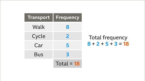
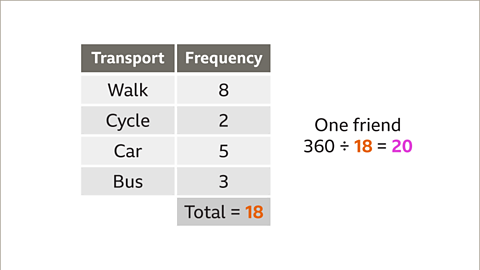
- Add the total frequency in the table.
- Divided 360° by the total frequency.
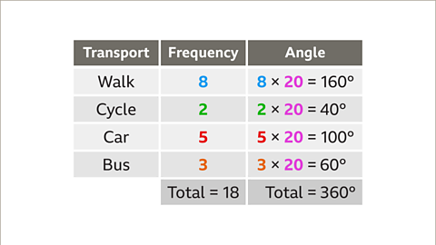
- Multiply each frequency by this value. These are the angles for each sector.
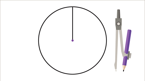
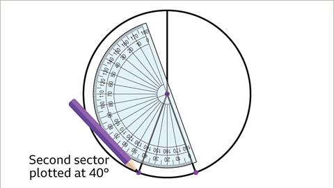
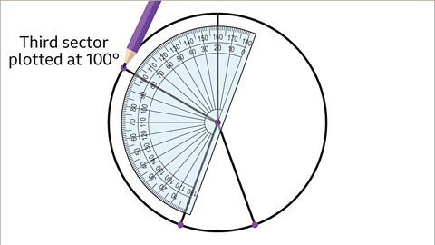
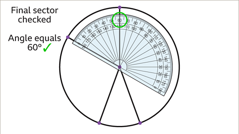
- Construct a circle and draw a vertical line from the top to the centre.
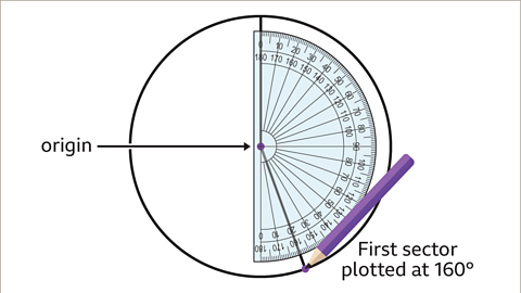
- In a clockwise direction, use a protractor to plot each angle in turn.
- Label each sector or use a key to colour code each.
- Give your pie chart a title.
Examples
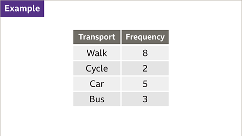
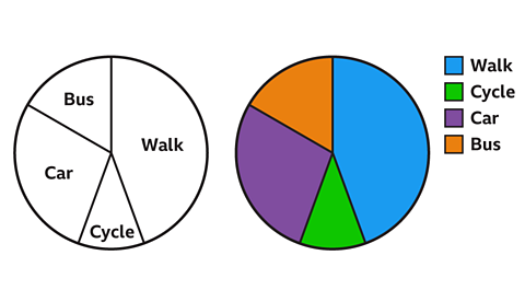
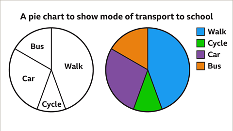
Image caption, A student asked their friends how they got to school. The table shows the results. Construct a pie chart to represent the data.
1 of 10
Question
A café owner recorded the type and number of drinks ordered in an hour.The table shows the results. If these were to be represented as a pie chart, what angle would be needed for each sector?
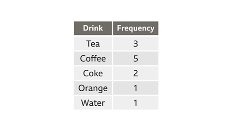
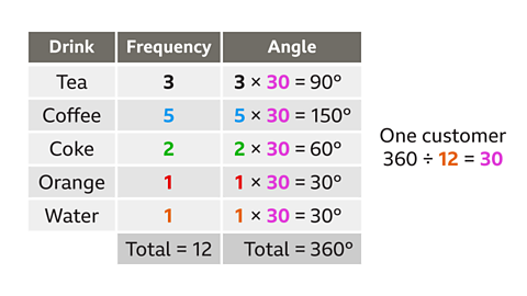
In this table the frequencies total 12
360 ÷ 12 = 30
This means each customer is equivalent to 30°.
Multiplying each drink by 30 gives:
- tea = 3 × 30 = 90
- coffee = 5 × 30 = 150
- coke = 2 × 30 = 60
- orange = 1 × 30 = 30
- water = 1 × 30 = 30
Interpreting a pie chart
It is possible to interpret a pie chart by looking at the proportions of the sectors.
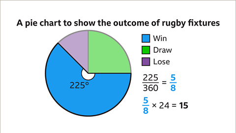
The angles can be used to work out what proportion of the whole population a pie chart sector represents. These fractions would be out of 360°, the number of degrees in a full turn.
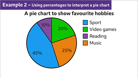
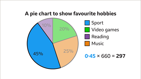
A pie chart may include the percentages of what each sector represents. These can also be used to work out proportions of the whole population.
Examples
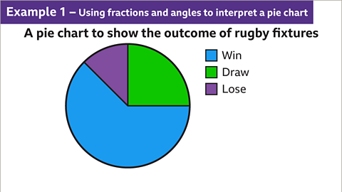
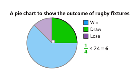
Image caption, The pie chart shows the outcome of results for a rugby team during a season.

1 of 6
Question
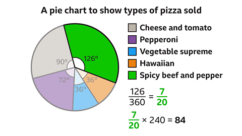
The pie chart represents the types of pizza sold during one evening.If 240 pizzas were sold, how many were spicy beef & pepper?
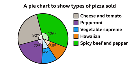
The sector representing the spicy beef and pepper pizzas measure 126°.
As a fraction of the whole pie chart, this represents \( \frac{126}{360}\) = \( \frac{7}{20}\)
Spicy beef and pepper pizzas = \( \frac{7}{20}\) × 240 = 84 pizzas.
84 spicy beef and pepper pizzas were sold.
Practise comparing and interpreting pie charts
Quiz
Practise comparing and interpreting pie charts with this quiz. You may need paper and a pen to help you.
Game - Divided Islands
Play the Divided Islands game! game
Using your maths skills, help to build bridges and bring light back to the islands in this free game from BBC Bitesize.

More on Representing data
Find out more by working through a topic
- count5 of 6

- count6 of 6
- count1 of 6

- count2 of 6