Key points
- A line graph is a type of graph used to spot A pattern in data. in data over time, eg hours in a day or months in a year. The data points are joined together by A specific part of a line between two points..
- In a line chart the The number of times something occurs. is usually represented on the A line that is perpendicular to the horizon. scale. The labelling on the A line that is parallel to the horizon. scale represents the increments of time.
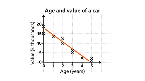
- Some line graphs use a false origin. A false origin allows the vertical scale to start at a different value.
How to create a line graph
In order to produce a line graph, data is required. The data often comes in the form of a table.
To create a line graph:
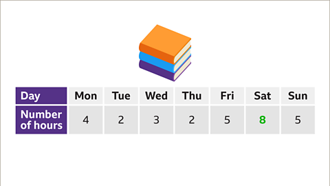
- Look for the largest frequency in your table.
- Draw a The line on a graph that runs vertically (up-down) from the origin. on your square paper or graph paper.
- Choose an appropriate scale for this axis and label your axis up to the largest frequency.
- Look at how many subdivisions are needed for the The line on a graph that runs horizontally (left-right) from the origin. .
- Draw and label the horizontal axis.
- Plot each data point, based on the frequencies and time intervals.
- Join each data point to the next, using straight lines.
- Check you have labelled each axis correctly, and give your line graph a title.
Examples
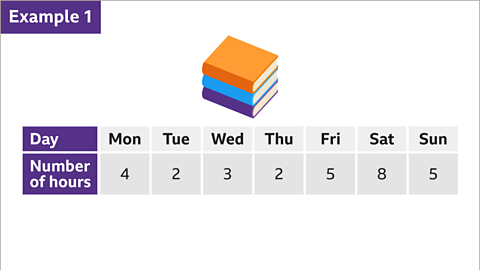
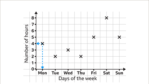
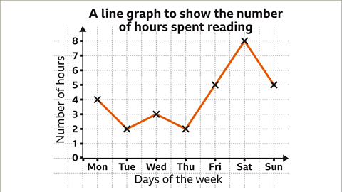
Image caption, A student recorded how much time they spent reading during a week. The table shows the results. Construct a line graph to represent the data.


1 of 10
Question
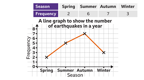
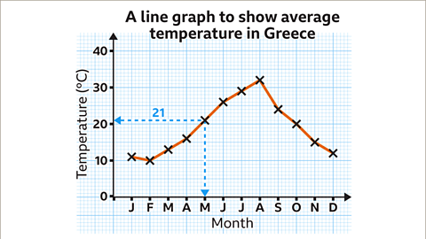
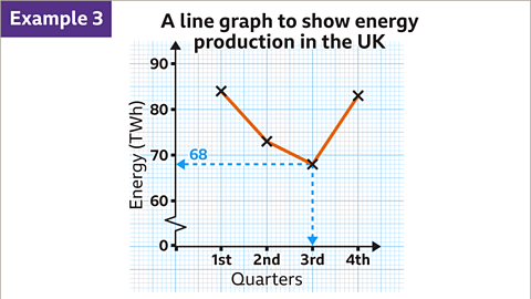
The line graph below shows the number of parcel deliveries completed on each day of the week.
How many parcels were delivered on Wednesday?

The number of parcels delivered on Wednesday is 102
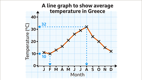
A false origin has been used on the vertical scale.
The scale is going up in increments of 20
Between each multiple of 20 is ten subdivisions.
Each subdivision is worth two parcels.

Practise comparing and interpreting line graphs
Practise comparing and interpreting line graphs with this quiz. You may need paper and a pen to help you.
Quiz
Real-life maths

An An investor is a person who puts money (capital) into something with the expectation of a future financial return. might use line graphs to track the value of companies over time.
By watching the rise and fall in a company’s A share is a small part or unit of the value of a company. they might be able to work out a good time to buy and sell shares in order to get the best return.
Game - Divided Islands
Play the Divided Islands game! game
Using your maths skills, help to build bridges and bring light back to the islands in this free game from BBC Bitesize.

More on Representing data
Find out more by working through a topic
- count3 of 6
- count4 of 6
- count5 of 6

- count6 of 6