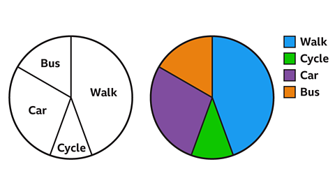
Key points
A scatter diagram or scatter graph is used to explore patterns between two sets of A collection of facts or observations about something. (known as 'bi-variate' data).
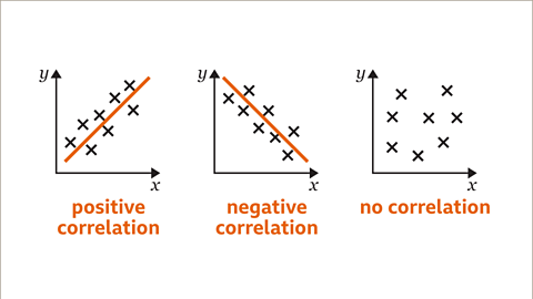
If there is a relationship between the two variables it is called a The relationship between two sets of data. Usually described as positive or negative..
By exploring the patterns between the variables it may be possible to draw a A smooth line on a graph that goes through the middle of as many points as possible. Around half of any points that aren’t on the line are above it and the other half are below it. . A line of best fit generalises the trend and can be used to make predictions.
How to draw scatter diagrams and correlation
To produce a scatter diagram data is required. The data often comes in the form of a table.
To create a scatter diagram:
- Look for the smallest and largest frequencies in both A quantity that can take on a range of values. in your table.
- Draw a horizontal axis on your square paper or graph paper to represent one variable.
- Choose an appropriate scale for this axis and label your axis. Decide if you need to use a A symbol indicating a break in the scale on an axis. .
- Draw a vertical axis on your square paper or graph paper to represent the other variable.
- Choose an appropriate scale for this axis and label your axis. Decide if you need to use a false origin.
- Plot each data point carefully on the graph.
- Check you have labelled each axis correctly and give your scatter diagram a title.
Examples
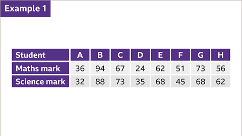
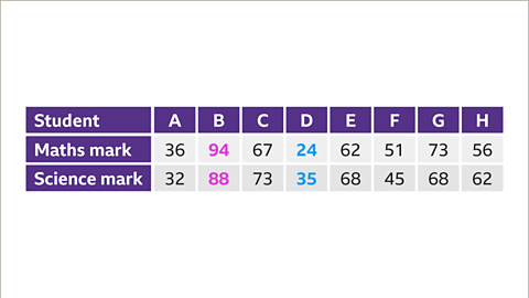
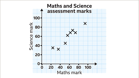
Image caption, The table shows the results of eight students' maths and science marks in an assessment. Construct a scatter graph that represents these results.
1 of 9
Question
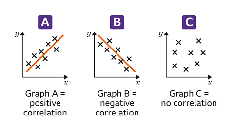
Graph A, Graph B and Graph C each demonstrate a different type of correlation.
One shows no correlation, another a positive correlation and the other a negative correlation.
Decide which correlation belongs to which graph.
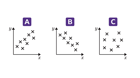
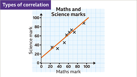
The data points in Graph A show that as one variable increases, the other variable increases. This is a positive correlation.
In Graph B, as one variable increases, the other variable decreases. This is a negative correlation.
In Graph C, the data points show no relationship between the variables, therefore there is no correlation.
How to draw and use a line of best fit
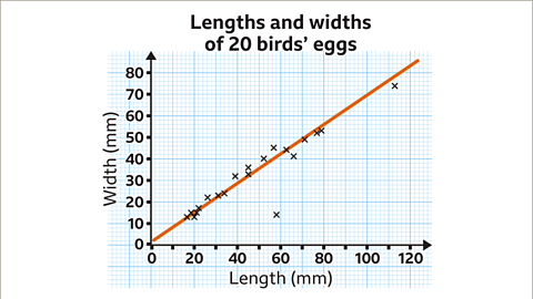
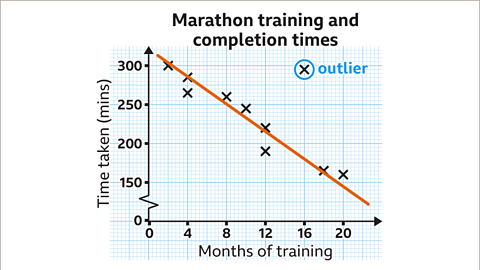
When a scatter diagram has a positive or negative correlation it is possible to draw a A smooth line on a graph that goes through the middle of as many points as possible. Around half of any points that aren’t on the line are above it and the other half are below it. . The line of best fit should approximate the trend. The line of best fit does not have to go through the origin.
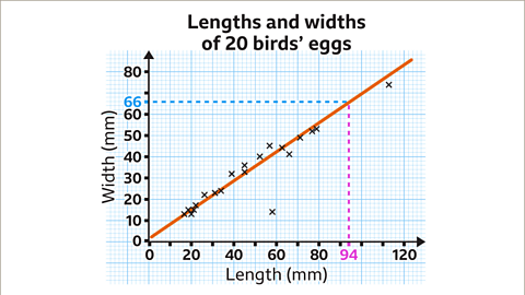
It is possible to use the line of best fit to make predictions.
If there is a data point that does not fit the trend it is called an outlier.
Examples
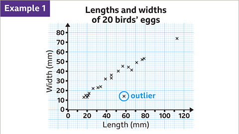
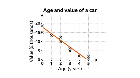
Image caption, The scatter diagram shows the relationship between the length and width of twenty birds' eggs. The horizontal and vertical scales are going up in increments of 10. Between each multiple of 10 is five subdivisions. Each subdivision is worth 2 mm. One piece of data does not match the trend. It is a long way from the rest of the data. The item of data at (58, 14) is called an outlier. Outliers need to be identified before drawing the line of best fit.

1 of 6
Question
The scatter graph shows the relationship between the temperature on a given day and the number of ice creams sold in a café.
A line of best fit has been drawn.
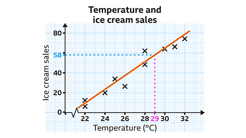
Use the line of best fit to predict how many ice creams will be sold on a day where the temperature is 29°C.
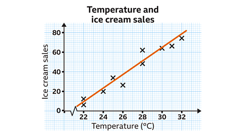
The vertical scale is going up in increments of 20
Between each multiple of 20 are ten subdivisions. Each subdivision is worth two ice creams.
Using the line of best fit, 58 ice creams would be sold when the temperature is 29°C.
Practise understanding scatter diagrams
Quiz
Practise understanding scatter diagrams with this quiz. You may need a pen and paper to help you with your answers.
Real-life maths
A A person whose job is to collect, study and explain data in order to solve problems or make informed decisions. may use scatter diagrams to look for patterns and trends. These can then be used to make projections. A projection is an estimate or guess at what may happen in the future based on trends.
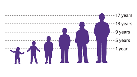
However, there is no guarantee that a A steady increase or decrease of variables over time. On a graph this would look like a straight line going upwards or downwards. will continue indefinitely. For example, as a person's age increases during childhood, their height typically increases. This would be a positive The relationship between two sets of data. Usually described as positive or negative.. This trend does not continue forever as, although people continue to grow older, they eventually stop growing taller.
Game - Divided Islands
Play the Divided Islands game! game
Using your maths skills, help to build bridges and bring light back to the islands in this free game from BBC Bitesize.

More on Representing data
Find out more by working through a topic
- count1 of 6

- count2 of 6
- count3 of 6
- count4 of 6